Use and Misuse of Graphical Representations
Learning Objectives
- Identify which type of graph best represents the data for a given situation.
- Explain how graphs can lead to misinterpretation of data.
Introduction
In addition to bar graphsA graph that uses horizontal or vertical bars to represent data., histogramsA graph using bars to show continuous quantitative data over a series of similar-sized intervals. The height of the bar shows the frequency of the data, and the width of the bar represents the interval for the data., and circle graphsAlso called a pie chart, a type of graph where categorical data is represented as sections of a whole circle. (pie charts), there are other graphs that statisticians use to represent data and analyze what it shows. But you have to be careful when creating and reading graphs. If they are not carefully created, they can be misleading, and sometimes people purposefully make them misleading.
Choosing what type of graph to use to represent a specific data set takes some trial and error. And, sometimes, there is more than one appropriate type of graph you can use. What you choose depends on the way you want to present your data, as well as your own personal preferences. Modern spreadsheet programs like Excel are very flexible at creating different types of graphs; with only a couple clicks, you can view data represented as a bar graph, line graph, or circle graph. From there, you can choose which one best paints the picture you want to show.
Since there is often more than one way to graph a data set, let’s look at some examples and think about the different possibilities that are available to us.
|
Example
|
|
Problem
|
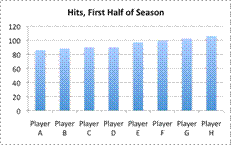
A baseball writer wants to create a graph showing the total hits for the players with the greatest number of hits in the first half of the baseball season. These players have the following number of hits: `86, 88, 90, 90, 97, 99, 102`, and `106`. What type of graph should the writer use to represent the data?
|
|
|
|
The data set contains information about the hit totals of `8` players. Either a bar graph or a pictograph could help show the total number of hits that each player had compared to the other players.
|
|
|
|
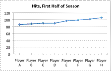
A line graph would not be appropriate, since the data is not continuous. There is no data “in between” each player’s hit totals.
|
|
|
|
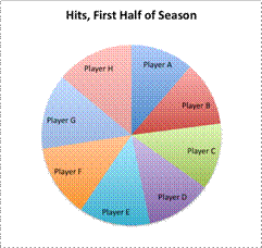
A circle graph does not make sense either, unless the writer wants to show the percentage of hits that each player has of the total number of hits. But that data wouldn’t be too helpful if the writer just wants to show the total amount of hits.
|
|
Answer
|
A bar graph or pictograph would work best here. (A pictograph may be preferable for a small amount of data, and a bar graph may be preferable for a lot of data.)
|
The writer could use a stem-and-leaf plot to show the distribution of numerical data, but this kind of graph is not as effective at showing the relationship between each player and the number of hits that he has. A box-and-whisker plot, which shows the middle of a data set, is not useful here since the writer is interested in the hit totals, not the average number of hits or the spread of the data.
|
Example
|
|
Problem
|
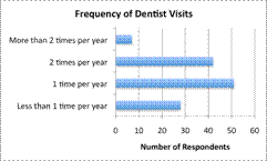
A statistician is collecting data on the frequency with which adults go to the dentist. She surveys `128` people and finds the following information.
Less than `1` time per year: `28` respondents
`1` time per year: `51` respondents
`2` times per year: `42` respondents
More than `2` times per year: `7` respondents
In a presentation to dentists, she especially wants to highlight the population that visits the dentist less than `1` time per year. What type of graph should she use to represent the data?
|
|
|
|
To show her findings, the statistician could use a couple of different graphs. A bar graph would be fine to use here since the data is categorical. She has grouped her findings into `4` categories.
|
|
|

|
A circle graph may be even better. The statistician is interested in the percentage or share of people who responded to each question. A circle graph allows for easy comparison among the categories surveyed.
|
|
Answer
|
A circle graph is best, but a bar graph would also be acceptable.
|
As with the first example, stem-and-leaf plots and box-and-whisker plots are not useful here. The statistician is not interested in the average amount of times that a person goes to the dentist each year. A line graph would not be appropriate either, as the data is not continuous.
|
Example
|
|
Problem
|
An amusement park planner wants to better understand the distribution of wait times that people experience while waiting for a popular ride. At the park one day, he asks `15` random people about the length of time they had to wait (in minutes).
`12, 3, 2, 10, 12, 0, 2, 0, 8, 5, 4, 0, 7, 4, 6`
What type of graph provides the best visual representation of this set of data: a circle graph, a box-and-whisker plot, or a bar graph?
|
|
|
|
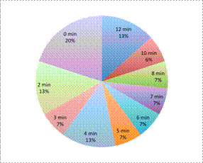
The key idea here is that the planner wants to understand the distribution of wait times. A circle graph does not show distribution. The planner could create a circle graph (like the one at left) that shows the percentage of people who waited for different amounts of time, but this does not help him understand the distribution of the data.
|
|
|
|
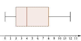
Creating a box-and-whisker plot would be more helpful. This type of graph would show the distribution more effectively, as seen at left. Half the people waited between `2` and `8` minutes for the ride.
|
|
|
|
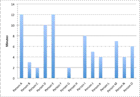
A bar graph can show the length that each person waited, but it does not show much about the distribution of wait times.
|
|
Answer
|
A box-and-whisker plot is best.
|
Ultimately, the box-and-whisker plot gives the most information about distribution, so it is the most useful.
|
|
An oceanographer wants to make a graph that shows the height (in centimeters) of a specific coral over the period of `2` years. Which type of graph is the most appropriate?
A) Circle graph
B) Box-and-whisker plot
C) Line graph
D) Stem-and-leaf plot
A) Circle graph
Incorrect. A circle graph is often used to show parts of a whole, not changes over time. The correct answer is a line graph.
B) Box-and-whisker plot
Incorrect. A box-and-whisker plot is used to show the middle of a data set; it does not reveal much about growth over time. The correct answer is a line graph.
C) Line graph
Correct. A line graph mapping height along the `y`-axis and time along the `x`-axis is the most appropriate type of graph for this situation.
D) Stem-and-leaf plot
Incorrect. A stem-and-leaf plot is used to show the spread of a data set; it does not reveal much about growth over time. The correct answer is a line graph.
|
As you have seen, graphs provide a visual way to represent data sets. Pictures can be misleading, though, so you also need to know how to identify graphs that seem to show something different than what the data says. This may be due to carelessness or it may be done on purpose. Below are some general questions to keep in mind as you read graphs.
|
Questions to Consider when Reading Graphs
- Are the graphs labeled sufficiently?
- What is the scale?
- Does the graph show a full picture of the data, or only a select picture?
|
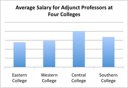
Look at the graph that follows. The title states “Average Salary for Adjunct Professors at Four Colleges,” and four bars appear on the graph. You can tell which colleges are being compared, but you are given no information about the scale that is being used. The graph makes it appear that the average salary for Adjunct Professors at Central College is much higher than that at Eastern College, but without a scale, you cannot know for certain. (You do know that the salary is higher; you just do not know how much higher.) To make this graph less misleading, a `y`-axis with salary information should be included.
Even when both axes are present and labeled correctly, graphical representations of data can be misleading. This is shown in the set of attendance graphs that follow.
In the graph on the left, the scale begins at `0` and goes to `20,000`. The graph itself shows that attendance at Minneapolis Wildcats games has steadily increased each year since `2008`, topping out in `2010` at just over `16,000`.
Now look at the graph on the right. It appears to show that attendance at St. Paul Strikers’ games has increased even more dramatically: the bar for `2010` is more than twice as tall as that in `2008`. From looking at these two graphs, you may conclude that the Strikers have been the more popular team recently, as the height of the bars seems to indicate that their attendance has grown faster than that of the Wildcats.
But notice something interesting: the scale of the Strikers graph is very different. It begins at `10,000`! This paints a skewed picture of the data when compared with the Wildcats graph, which starts at `0`. And by examining the actual data (the actual attendance, not just the height of the bars), you can tell that attendance is actually greater at the Wildcats games. In `2010`, for instance, Wildcats attendance is a little over `16,000`, while attendance at Strikers games is below `15,000`.
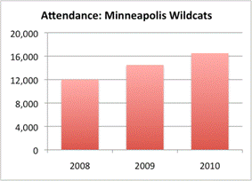
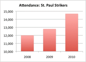
This brings up an important point. When you are using graphs to compare data sets, the scales need to be consistent; otherwise, it is very difficult to compare the data itself. As you can tell from the two previous graphs, changing the scale of a graph can dramatically change the way it looks and the impression the graph makes.
A more honest representation of the attendance data can be found in a double-bar graph, where the attendance figures from both teams is mapped side-by-side using the same scale. Look at the results below. Now it is clear that the attendance for the Wildcats is greater than the attendance for the Strikers.

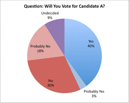
The circle graph here is another example of a misleading representation. The actual percentages of people who responded to each question are not available, and the viewer has to interpret the data based on the size of the sections. At first glance, this graph seems to be showing that a lot of voters seem to be favoring Candidate A, as the “Yes” section is very large.
Part of the reason why this section appears large is because the graph has been created so that it looks large. The circle graph is presented in three-dimensional form, and the data that is foremost in the graph (the “Yes” slice) appears the most prominent. The creator of this graph is hoping that this graph will make you think that Candidate A is very popular!
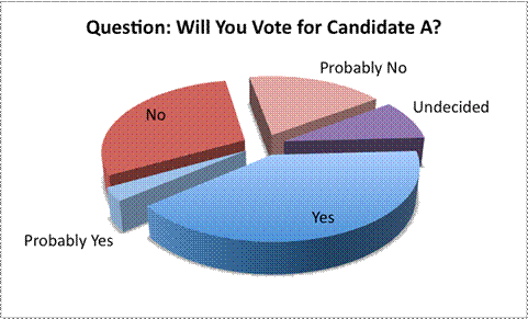
On closer inspection, though, the data does not seem to support this contention. Combining the “Yes” and “Probably Yes” sections is roughly equal to combining the “No” and “Probably No” sections, which means that the candidate is not as popular as this representation would suggest. In fact, someone who did not want this candidate to appear favorable could have represented the data using the next graph. Notice the different positions of the “No” and “Probably No” sections, as well as the consistent colors.
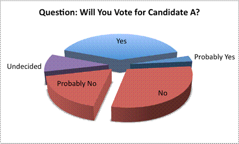
Notice how perspective and color make a difference in viewing and analyzing data!
Next is a more honest way of representing this data. In this graph, the circle graph is shown from above, and the actual percentages are included.
|
Results from a poll measuring a politician’s approval rating are shown in the table below.
|
Date
|
Approval Rating (%)
|
|
January
|
`55%`
|
|
February
|
`58%`
|
|
March
|
`59%`
|
|
April
|
`56%`
|
|
May
|
`59%`
|
|
June
|
`56%`
|
|
July
|
`52%`
|
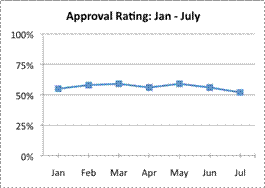
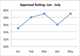
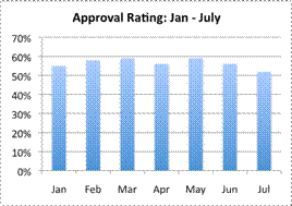
Which of the following graphs is most misleading?
A)
B)
C)
D)
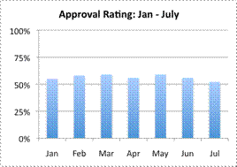
A) Incorrect.
This line graph accurately displays the data; the axes are labeled appropriately, and the scale is from `0%` to `100%`. The graph shows that although there has been some up and down variation, the politician’s approval rating has stayed in the mid-`50`’s. The correct answer is Graph B.
B) Correct.
This graph uses a very small scale (`10%`, from `50%` to `60%`) and has eliminated the final two data points. This graph represents only a part of the data, and is designed to make the reader think that the politician is rated more favorably than he really is.
C) Incorrect.
This bar graph accurately displays the data; the axes are labeled appropriately, and the scale is from `0%` to `70%`. The politician’s approval ratings look a bit higher in this graph than they do in Graph D, but there is nothing dishonest about this graph. The graph shows that although there has been some up and down variation, the politician’s approval rating has stayed in the mid-`50`’s. The correct answer is Graph B.
D) Incorrect.
This bar graph accurately displays the data; the axes are labeled appropriately, and the scale is from `0%` to `100%`, with `25%` increments. It looks different than Graph C, but the data itself is not misleading: it is the scale of the data that is different. The correct answer is Graph B.
|
Summary
Graphs have a big impact on how you understand a set of data. Use an appropriate type of graph and you can communicate your data effectively; use the wrong type of graph, though, and your viewers may misunderstand the story you are trying to tell. When reading graphs in newspapers and online, be sure to look at the axes, the scale, and the presentation of the data itself. These can all help you identify if the graph is representing a data set fairly or unfairly.