Other Types of Graphs
Different graphs tell different stories. While a bar graph might be appropriate for comparing some types of data, there are a number of other types of graphs that can present data in a different way. You might see them in news stories or reports, so it’s helpful to know how to read and interpret them.
Sometimes you will see categorical data presented in a circle graphAlso called a pie chart, a type of graph where categorical data is represented as sections of a whole circle., or pie chart. In these types of graphs, individual pieces of data are represented as sections of the circle (or “pieces of the pie”). Circle graphs are often used to show how a whole set of data is broken down into individual components.
Here’s an example. At the beginning of a semester, a teacher talks about how she will determine student grades. She says, “Half your grade will be based on the final exam and `20%` will be determined by quizzes. A class project will also be worth `20%` and class participation will count for `10%`.” In addition to telling the class this information, she could also create a circle graph.
This graph is useful because it relates each part (the final exam, the quizzes, the class project, and the class participation) to the whole. It is easy to see that students in this class had better study for the final exam!
Because circle graphs relate individual parts and a whole, they are often used for budgets and other financial purposes. A sample family budget follows. It has been graphed two ways: first using a bar graph, and then using a circle graph. Each representation illustrates the information a little differently.
The bar graph shows the amounts of money spent on each item during one month. Using this data, you could figure out how much the family needs to earn every month to make this budget work.
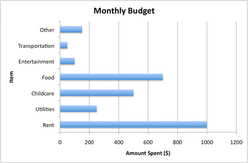
The bar graph above focuses on the amount spent for each category. The circle graph below shows how each piece of the budget relates to the other pieces of the budget. This makes it easier to see where the greatest amounts of money are going, and how much of the whole budget these pieces take up. Rent and food are the greatest expenses here, with childcare also taking up a sizeable portion.
If you look closely at the circle graph, you can see that the sections for food, childcare, and utilities take up almost exactly half of the circle: this means that these three items represent half the budget! This kind of analysis is harder to do with bar graphs because each item is represented as its own entity, and is not part of a larger whole.

Circle graphs often show the relationship of each piece to the whole using percentages, as in the next example.
|
Example |
||
|
Problem
|
The circle graph below shows how Joelle spent her day. Did she spend more time sleeping or doing school-related work (school, homework, and play rehearsal)?
|
|
|
|
Sleeping: `36%`
School-related: `27% + 8% + 11%=46%`
|
Look at the circle graph. The section labeled “Sleeping” is a little larger than the section named “School” (and notice that the percentage of time sleeping is greater than the percentage of time at school!) “Homework” and “Play rehearsal” are both smaller, but when the percentages of time are added to “School,” they add up to a larger portion of the day. |
|
Answer |
Joelle spent more time doing school-related work. |
|
|
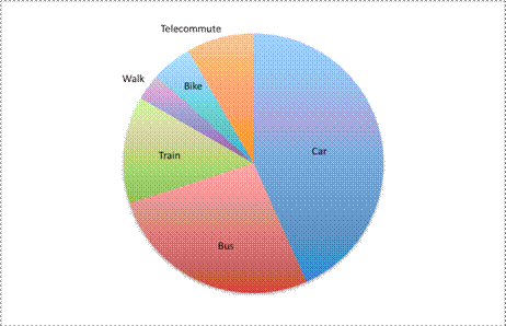
The graph below shows data about how people in one company commute to work each day.
Which statement is true?
A) Everyone takes a car, bus, or train to work.
B) Taking the bus is more popular than walking or biking.
C) More people take the train than take the bus.
D) Telecommuting is the least popular method of commuting to work.
|
Unlike circle graphs, line graphsUsed to show continuous data, a graph where individual data points are connected with line segments. Line graphs are typically used for data sets that track a quantity over time. are usually used to relate data over a period of time. In a line graph, the data is shown as individual points on a grid; a trend line connects all data points.
A typical use of a line graph involves the mapping of temperature over time. One example is provided below. Look at how the temperature is mapped on the `y`-axis and the time is mapped on the `x`-axis.
Each point on the grid shows a specific relationship between the temperature and the time. At `9` AM, the temperature was `82^@`. It rose to `83^@` at `10` AM, and then again to `85^@` at `11` AM. It cooled off a bit by noon, as the temperature fell to `82^@`. What happened the rest of the day?
The data on this graph shows that the temperature peaked at `88^@` at `3` PM. By `9` PM that evening, it was down to `72^@`.
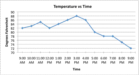
The line segments connecting each data point are important to consider, too. While this graph only provides data points for each hour, you could track the temperature each minute (or second!) if you wanted. The line segments connecting the data points indicate that the temperature vs. time relationship is continuous, meaning it can be read at any point. The line segments also provide an estimate for what the temperature would be if the temperature were measured at any point between two existing readings. For example, if you wanted to estimate the temperature at `4":"30`, you could find `4text(:)30` on the `x`-axis and draw a vertical line that passes through the trend line; the place where it intersects the graph will be the temperature estimate at that time.

Note that this is just an estimate based on the data. There are many different possible temperature fluctuations between `4` PM and `5` PM. For example, the temperature could have held steady at `86^@` for most of the hour, and then dropped sharply to `80^@` just before `5` PM. Alternatively, the temperature could have dropped to `76^@` due to a sudden storm, and then climbed back up to `80^@` once the storm passed. In either of these cases, our estimate of `83^@` would be incorrect! Based on the data, though, `83^@` seems like a reasonable prediction for `4text(:)30` PM.
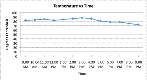
Finally, a quick word about the scale in this graph. Notice the `y`-axis, which is the vertical line where the Degrees Fahrenheit are listed. Notice that it starts at `70^@`, and then increases in increments of `2^@` each time. Since the scale is small and the graph begins at `70^@`, the temperature data looks pretty volatile, as if the temperature went from being warm to hot to very cold! Look at the same data set when plotted on a line graph that begins at `0^@` and has a scale of `10^@`. The peaks and valleys are not as apparent!
As you can see, changing the scale of the graph can affect how a viewer perceives the data within the graph.
|
Example |
|
|
Problem
|
Population data for a fictional city is given below. Estimate the city’s population in `2005`.
|
|
|
Look at the line graph. The population starts at about `0.7` million (or `700,000`) in `2000`, rises to `0.8` million in `2001`, and then again to `1.1` million in `2002`. To find the population in `2005`, find `2005` on the `x`-axis and draw a vertical line that intersects the trend line.
|
|
|
The lines intersect at `1.4`, so `1.4` million (or `1,400,000`) would be a good estimate. |
|
Answer |
The population in `2005` was about `1.4` million. |
A stem-and-leaf plotA type of graph used to visualize quantitative data. In a stem-and-leaf plot the digits of each number are organized separately to display a set of data. provides yet another way to visualize quantitative data. They retain the original data (unlike pictographs), and allow easy identification of the largest and smallest values, clusters, and gaps.
Here’s an example. An economist is wondering about the amount of spare change that people carry, and whether the amount is greater in the morning or in the evening. To collect this data, she heads to a subway station downtown and, one morning, randomly asks people to count the amount of change they have in their pocket or purse. She stops when she has asked `30` people how much change they are carrying. The results are shown here in the table.
Pocket Change (in cents)
|
`0` |
`85` |
`95` |
|
`50` |
`44` |
`81` |
|
`12` |
`25` |
`25` |
|
`15` |
`10` |
`5` |
|
`0` |
`76` |
`0` |
|
`59` |
`75` |
`73` |
|
`4` |
`94` |
`62` |
|
`42` |
`0` |
`60` |
|
`75` |
`15` |
`25` |
|
`31` |
`38` |
`50` |
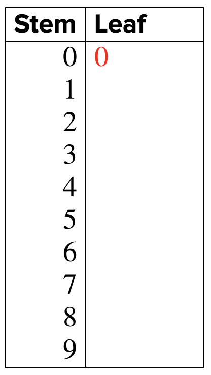
The economist wants to get a better sense of this data, so she creates a stem-and-leaf plot. In this graph, the “stem” is the ten’s digit for each piece of data and the “leaf” is the one’s digit. If she had to graph a three-digit number, the stem would be the first two digits and the leaf would be the ones digit. The key point in a stem-and-leaf plot is that the leaves do not contain more than the `10` digits from `0` through `9`.
She begins by listing the stem values, which are all the possible tens digits: the numbers from `0` to `9`.

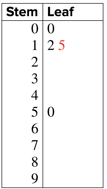
Then she starts going through her data. The first person said that he was carrying `0` cents. The stem here is `0`, and the leaf is also `0` (it is important to include this `0` to show that data was collected).
Looking down the table, she sees the next two pieces of data: `50` and `12`. She enters that data in the graph.
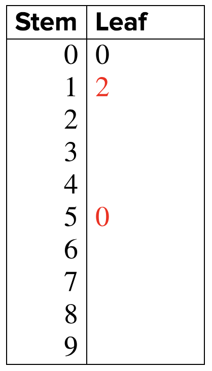
The next piece of data is `15`. The stem is `1` and the leaf is `5`, so she puts the `5` next to the `2` that is already in the leaf section of the graph.
She continues to add pieces of data until she has the following stem-and-leaf plot.
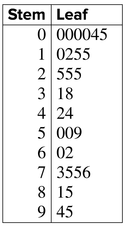
From this plot, she can see that half the people carried less than `40` cents (since there are `30` pieces of data, the median number is the average of the `15`th and `16`th items. The `15`th item is `38` and the `16`th is `42`, so the median is `40`.) The data is fairly spread out, too; there does not seem to be a discernible pattern about how much change people are carrying.
That afternoon, the economist gathers change data from `30` more people. Instead of making a new stem-and-leaf plot, though, she rearranges her original graph and adds on the new data by adding a new set of leaves, as shown here.
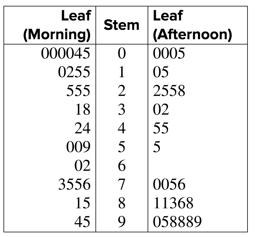
She notices that the shape of the afternoon data is different than the shape of the morning data. In the morning, many people were carrying less than `40` cents. In the afternoon, however, people seemed to be carrying more change, with half the respondents carrying between `70` cents and `99` cents.
|
Example |
||
|
Problem
|
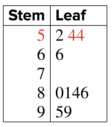
A biologist uses a stem-and-leaf plot to record the ages (in years) of ten trees in a forest. How old were the trees that she surveyed?
|
|
|
|
|
To read a stem-and-leaf plot, look at the stem, then the leaf. The first piece of data has a stem of `5` and a leaf of `2`. This is the number `52`. |
|
|
|
The second piece of data also has a stem of `5` but a leaf of `4`. This is the number `54`.
|
|
|
|
Continue reading the stems and leaves in the graph. |
|
Answer |
The ages of the trees are `52, 54, 54, 66, 80, 81, 84, 86, 95`, and `99`. |
|
|
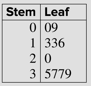
Which set of numbers does this stem-and-leaf plot represent?
A) `0, 9, 13, 13, 16, 20, 35, 37, 37, 39`
B) `0, 0, 3, 3, 5, 6, 7, 7, 9, 9`
C) `0, 9, 13, 16, 20, 35, 37, 39`
D) `0, 2, 31, 31, 53, 61, 73, 73, 90, 93`
|
Bar graphs are only the beginning of the story when it comes to visualizing data sets. Circle graphs show how a set of data is divided up into sections, and they help the viewer visualize how each section relates to the whole. By contrast, line graphs are usually used to relate continuous data over a period of time. A third type of graph, the stem-and-leaf plot, provides another way to organize quantitative data. Stem-and-leaf plots are useful for getting a quick picture of the smallest and largest values, clusters, and gaps of the data within a set.