Graphing Data
A nurse is collecting blood type data from her patients. When a new patient is checked in, the nurse does a simple finger-prick test to see whether the patient’s blood is type A, B, AB, or O. (These are the four possible blood types. Each one also carries a `+` or `-` to represent the RH factor, but for our purposes, let’s just track the type, not the `+` or `-`.) She tracks her results by creating a two-column table with the patient’s name and blood type.
|
Name |
Blood Type |
|
Dominique |
A |
|
Ilya |
O |
|
Raul |
AB |
|
Madison |
O |
|
Philip |
AB |
|
Samuel |
B |
|
Josefine |
O |
|
Brett |
O |
|
Paula |
B |
|
Leticia |
AB |
The information in this table is an example of dataMathematical term for information such as values or measurements., or information. In this case, the nurse has gathered a fair amount of data about her patients’ blood types. By analyzing the data, she can learn more about the range of patients that she serves.
Data helps us make many kinds of decisions. Organizing data into graphs can help us get a clear picture of a situation and can often help us make decisions based on the picture. So how do you take data and make a picture out of it? Let’s take a look.
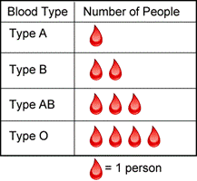
Let’s return to the data set used previously. If the nurse wanted to represent the data visually, she could use a pictographA graph that uses small icons or pictures to represent data.. Pictographs represent data using images. This visual presentation helps illustrate that for the data in her table, Type O blood is the most common and Type A blood is the least common.
Interested by the results of this small survey, the nurse continues to document the blood types of her patients until she has surveyed `100` people. She puts all of this data in a table, but she finds that it is hard for her to quickly identify what the data is telling her. She decides to make another pictograph using a different scale.
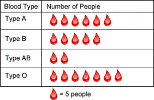
To read this pictograph, all you need is the scale, which, in this case, is the number of people that each blood drop symbol represents. In this graph, each blood drop represents `5` people. There are six drops next to Type A, so `5 * 6 = 30` people had Type A blood. The table below shows the rest of the information.
|
Blood Type |
Number of People |
|
Type A |
`6" drops" * 5" people" = 30" people"` |
|
Type B |
`5" drops" * 5" people" = 25" people"` |
|
Type AB |
`2" drops" * 5" people" = 10" people"` |
|
Type O |
`7" drops" * 5" people" = 35" people"` |
|
Example |
|||||||||||||
|
Problem
|
The pictograph below shows the number of medals earned at an international competition. How many medals did Japan earn?
M `= 4` medals |
||||||||||||
|
|
`5 * 4 = 20`
|
Look at the scale of the pictograph. Each M represents `4` medals.
Japan has `5` M symbols, so the total number of medals is `5 * 4 = 20`. |
|||||||||||
|
Answer |
Japan earned `20` medals. |
|
|||||||||||
|
Which table accurately represents the data shown in the pictograph below?
$ `= $4`
A)
B)
C)
D)
|
Representing data as pictures doesn’t always make sense either. Bar graphsA graph that uses horizontal or vertical bars to represent data. are an alternative (and popular) way to represent data sets, especially those with large amounts of data or which do not lend themselves well to individual symbols. In a bar graph, the number of items in a data category is represented by the height or length of bars.
As when reading pictographs, paying attention to the scale is essential: small differences in the height of two bars can sometimes represent thousands of dollars, for example!
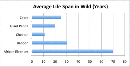
Let’s consider an example. Here is some information about the average life span of five animals in the wild, presented in a table.
|
Animal |
Average Life Span in the Wild (Years) |
|
Zebra |
`25` |
|
Giant Panda |
`20` |
|
Cheetah |
`11` |
|
Baboon |
`30` |
|
African Elephant |
`70` |
Source: National Geographic, accessed July `2011`
This data is fine in a table, but presenting it as a bar graph helps the viewer compare the different life spans more easily. Look at the bar graph below. In this example, the animals are listed on the left side of the graph (also called the y-axisThe vertical axis of a coordinate plane. Also the vertical axis of a bar graph or histogram.), and the life span in years is listed on the bottom (the x-axisThe horizontal axis of a coordinate plane. Also the horizontal axis of a bar graph or histogram.). The graph shows the information by the length of the bar associated with each animal name.
Bar graphs are generally used to compare quantities, not to determine exact quantities, especially when the scale is large, as in the next graph.
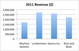
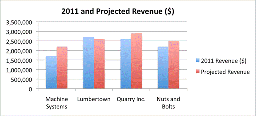
The bar graph below shows total revenue for four fictional companies in `2011`. Notice that the scale, on the `y`-axis, is very large; each horizontal line represents an increase of `$500,000`. For this reason, it is difficult to tell exactly how much money each company made in `2011`. However, comparing the bars is straightforward. Glancing at the data, you can tell that Lumbertown earned the most (a little over `$2,500,000`), while Machine Systems earned the least (about one million less, at just over `$1,500,000`).
You can also use bar graphs to showcase multiple pieces of information about a specific situation. For example, let’s show the next year’s projected revenue for each company on the graph that you just looked at. You can leave the existing bars in the graph and just add four more.
The blue columns remain, but now they are accompanied by four new red columns that represent the projected revenue for these companies. Again, this data could be expressed in a table. With a bar graph, you gain ease of quick comparison, but lose the detail of the exact values. Looking at this graph tells you that while Lumbertown has the highest revenue for `2011`, it is projected to decrease. Conversely, Machine Systems is projected to increase its revenue. Seeing data visually can help you understand the story that the data is telling about a situation.
|
Example |
||
|
Problem
|
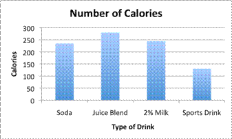
Use the graph to list the drinks from the most number of calories to the least number of calories (serving size: `16` ounces).
|
|
|
|
|
The `y`-axis shows total calories, and the `x`-axis shows the drink. The taller the bar, the more calories the drink has. |
|
|
Juice Blend `~~275`
`2%` Milk `~~245`
Soda `~~230`
Sports Drink `~~125` |
The juice blend contains over `250` calories, so it has the most calories per serving.
Soda and `2%` milk are both between `200` and `250` calories, but the bar for `2%` milk is taller, so it must contain more calories.
Sports drink has the shortest bar; it contains about `125` calories. |
|
Answer |
From most to least number of calories per serving: Juice Blend, `2%` Milk, Soda, Sports Drink |
|
|
Example |
||
|
Problem
|
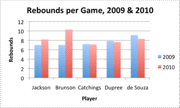
Based on the graph below, which player’s rebounding increased the most from `2009` to `2010`?
Source: WNBA.com, accessed July `2011` |
|
|
|
|
The `y`-axis shows rebounds per game, and the `x`-axis shows the player’s name. A taller bar represents more rebounds per game by the player.
This graph shows two sets of data: one for `2009`, in blue, and one for `2010`, in red. To compare the data from one year to the next, compare the heights of the two bars for each player. |
|
|
Jackson and Brunson |
Two players had higher rebound averages in `2010` than they did in `2009`. This is indicated by the red bar being taller than the blue bar. The other players’ red bars are shorter, so their rebounds decreased. |
|
|
|
Comparing the sizes of the increases, you can tell that Brunson increased her per game rebounding more than Jackson did. |
|
Answer |
The player whose rebounding increased the most from `2009` to `2010` was Brunson. |
|
The data sets you have looked at so far have shown categorical dataData that details non-numerical features of an object. Examples of categorical data include eye color, blood type, and types of computers.. Categorical data is data that can be separated into categories. For instance, data about eye color (brown, blue, green), blood type (O, A, B, AB), and the type of computer you use at work or home (PC or Mac) are all categorical.
Quantitative dataNumerical data. Examples of quantitative data include height, weight, and test scores. is sometimes called numerical data, because it is data that is represented by numbers. Quantitative data sets consist of quantities such as age (`1, 2, 23, 34, 77...`), test scores ( `90`, `95`, `100`, `72`...), and height (`55` inches, `50` inches, `68` inches…). Notice that all of the data here are numbers.
Continuous quantitative data can be graphed using a histogramA graph using bars to show continuous quantitative data over a series of similar-sized intervals. The height of the bar shows the frequency of the data, and the width of the bar represents the interval for the data.. A histogram resembles a bar graph, but instead of having categories along the axis, it has numbers listed in order and usually grouped in intervals (such as `0` to `10`, `11` to `20`, and so on). While the bars in bar graphs can have space between the bars, the bars of a histogram are usually touching, as the data is continuous.
Let’s look at how you could display the set of test score data listed below.
|
Name |
Score (`0` to `100`) |
|
Alex |
`81` |
|
Beatriz |
`73` |
|
Celia |
`79` |
|
Donnie |
`91` |
|
Erykah |
`87` |
|
Fred |
`79` |
|
Gigi |
`81` |
|
Helene |
`84` |
|
Irma |
`88` |
|
Joelle |
`96` |
Looking at the scores, you can tell that some people scored in the `70`s, some scored in the `80`s, and some scored in the `90`s. You can organize the data in a histogram with the continuous data from `0` to `100`, by using the intervals to `71` to `80`, `81` to `90`, and `91` to `100`.
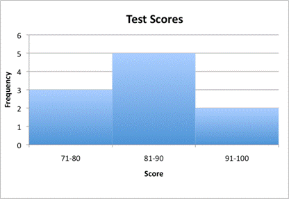
There are only three intervals for this histogram and ten data points. For a histogram to be meaningful, it should include `100` data points or more and `7` intervals or more. (For this reason, many histograms are created using a variety of technical tools.) The histogram then takes on interesting shapes that can provide a lot of information.
Even with only `10` data points, you find a much more meaningful histogram by using smaller intervals (such as `71` to `75`, `76` to `80`, `81` to `85`, `86` to `90`, `91` to `95`, and `96` to `100`).
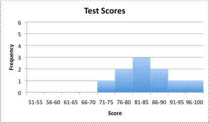
This second graph shows a bit of a curve to the data. Nobody scored `70` or lower, and the data peaks in the `81` to `85` range. Increasing the number of intervals has an effect on the shape of the graph, and helps us see some trends that are in the data.
|
Example |
||
|
Problem
|
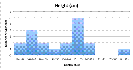
Based on the histogram below, how many students are between `151` and `180` centimeters tall?
|
|
|
|
Number of students in each interval: `151` to `155`, `1` `156` to `160`, `2` `161` to `165`, `6` `166` to `170`, `2` `171` to `175`, `0` `176` to `180`, `0` |
Each interval in this histogram is `5` centimeters. |
|
|
`1 + 2 + 6 + 2 + 0 + 0 = 11` |
Add the number of students. |
|
Answer |
`11` students are between `151` and `180` centimeters tall. |
|
|
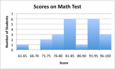
A teacher made this histogram to track scores on a recent math test. How many students scored in the `91` to `100` range?
A) `3`
B) `6`
C) `9`
D) `22`
|
Data is mathematical information. Mathematical data is often recorded in tables to organize, or spreadsheets to organize and sort. Graphs can help you see the data visually, which can help you to better understand the data. A pictograph is a graph that uses symbols to represent data. Bar graphs show the frequency of categorical data, using bars instead of symbols. Histograms are similar to bar graphs in that they are constructed out of a series of bars. However, histograms represent continuous quantitative (numerical) data, which can illustrate trends as well as other more advanced attributes.